Viewing Real-time Statistics and Insights
Navigator is a toolset designed to provide order-automation metrics and insights so that you can make data-driven decisions to improve order accuracy, automation, and operational efficiency.
To understand individual features, see the descriptions below.
Headlines of Key-Metrics
Headlines of key-metric averages display in large boxes for quick, at-a-glance viewing. They summarize the data to help you understand trends. In addition to the statistic in each, Headlines include a Trend line, in a white oval, that helps you visualize whether that metric is improving or not.

These metrics reflect data over the previous seven days. Additionally, some metrics are conditioned by selections in Navigator Settings. (See Navigator Settings). Headlines include:
|
Headline |
How Statistic is Calculated |
|---|---|
|
Orders to ERP on Time |
The percentage of documents delivered to the ERP prior to the ship-to date. White oval displays trend line describing direction of change as a percentage. |
|
Order Automation |
Total percentage of documents processed, based on the customer's target level of automation as it is defined in Navigator Settings. (See Navigator Settings). White oval displays trend line describing direction of change as a percentage. |
|
Orders with Errors |
An aggregate assessment of error frequency by type. Uses cumulative percentage of each type of error across all documents. White oval displays trend line describing direction of change as a percentage. |
|
Order Accuracy |
Accuracy as calculated in two ways, depending on the configuration:
White oval displays trend line describing direction of change as a percentage. |
|
Average Cost to Serve |
Cost Per Correction multiplied by Total User Corrections. White oval displays trend line describing direction of change as a percentage. |
Tabs
Tabs act as the main navigation menu to access each of the Statistical Graphs and the Data Grids.
Through these Statistical Graphs and Data Grids, Tabs provide targeted insights on different areas of the automation process and CSR performance through .
Statistical Graphs offer the relative size of different metrics in a way that’s often easier to understand. Graphs are different on each of the Detail Tabs you select from the Header.
Data Grids display the individual statistics that are reflected in the statistical graphs. This data is also the source for other statistical displays, such as averages. These grids are different on every tab.
You can view the information tabs in two different ways. Click the Display icon on any Statistical Graph screen and the format of the page reorganizes to show the Statistical Graph and the Data Grid in different locations. For example, if you click icon when the four squares are in colors, it allows the view of two tables in the space that one would normally occupy one.
For instructions on how to use tabs, click here.
Tabs include the following information. For more detailed descriptions on the source of each component, click the link a the bottom of each list.
Tab |
Information Components |
|---|---|
Order Statistics  Order Statistics
|
For detailed source information, click here. |
Orders with Errors  Orders with Errors |
For detailed source information, click here. |
Order Automation  Order Automation |
For detailed source information, click here. |
Order Accuracy Optimization  Order Accuracy Optimization |
For detailed source information, click here. |
CSR Performance  CSR Performance |
For detailed source information, click here. |
Filters
To help narrow your focus, use filters on each tab to show only the specific data you choose. Depending on the tab, for example, these can include Date Range, Divisions, Trading Partners, and Customer Service Representatives (CSRs).
Filters, include the following:
-
Date Range Calendar: Select the beginning and ending of the date range or select time periods from the Quickset
-
Check boxes to select one or more Trading Partners to view.
-
Check boxes to select one or more Customer Service Representatives (CSRs).
Note: The Divisions filter is not operable at this time.

For instructions on how to use filters, click here.
Key Metric Totals
Key Metric Totals at the top of each graph provide a quick summary of the most important metrics displayed within that tab.
Key Metric Totals display data tailored to each tab’s category. You can filter these metrics to focus on specific divisions, trading partners, CSRs, timeframes, or a combination of these criteria.

The totals are dynamically updated based on the visible data, so if filters are applied, the totals will reflect only the filtered data, offering an accurate snapshot of the current information.
For example, on the default, Order Statistics tab, the following totals are available:
-
Delivered on Time
-
Total Documents
-
Total Line Items
-
Dollars Processed
This information corresponds to data in both the Statistical Graphs and the Data Grids.
Insights
The Insights section displays real-time warnings, recommendations, possible actions, and forecasts. They are listed on the right side of your screen and remain constant, regardless of what tab you have open. Each includes a description of the issue and what may be affected for that trading partner, including trading partners, users, and documents.
Insights are generated based on patterns observed in customer data across trading partners, such as recurring errors or inefficiencies. They are triggered when specific patterns are detected in documents from the past two weeks that exceed thresholds for:
-
The number of documents affected
-
The number of fields that were corrected within those documents
-
Missing, duplicate, or unusual values in document fields
Each insight offers actionable suggestions and recommendations to help address the root cause of the problem. Many are tied to settings or transformations that are within your control. Follow that individual recommendation for instructions.
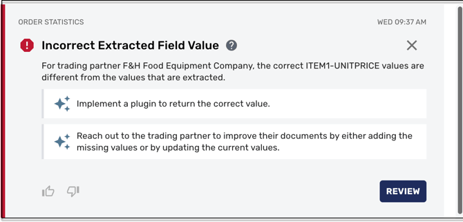
Reviewing an Insight’s Statistics
Each insight concerns only a single trading partner, field, and potential root cause. To review that trading partner’s statistics, click Review. The screen changes to display only statistics for the trading partner to which the insight belongs, including the Data Grid, the Statistical Graph, and the Key Metric Totals directly above the Statistical Graph.
Note: The actions of one user will not affect what another user sees. For example, if one user dismisses or filters out some insights, doing so will not affect what the next user can view, even if they share access to customers and trading partners.
To return to the previous screen, click Order statistics over time, in the upper left of the Statistical Graph section. The view moves back one screen at a time.