
Overview
Analytics provides a focused, insight-driven view of your document automation performance. Rather than requiring you to scan charts and draw your own conclusions,it surfaces the metrics that matter most, explain what changed and why.
This guide defines each metric, explains exactly how it is calculated, and clarifies what is and is not included in each result.
Global Filters

All metrics in Analytics share a consistent set of global filters. Selecting a filter applies it uniformly across every metric card, drill-down, and exported result, ensuring metrics analysis always reflects the same scope.
|
Filter name |
Detail |
|---|---|
|
Date Range |
Controls the time window for all metrics. Defaults to Delivered date. Any custom date range can be selected. |
|
Customer |
Limits results to one or more specific trading partners. |
|
Document processing tier |
Distinguishes between documents processed through Express and Premier. |
|
Business/Division |
Narrows results to a specific business unit or division within your organization. |
Note : Global filters are inherited by all drill-downs, slide-outs, and exports. Filters don't need to be re-applied when navigating deeper into a metric.
Metric Definitions
1. Document Delivery Rate
Definition
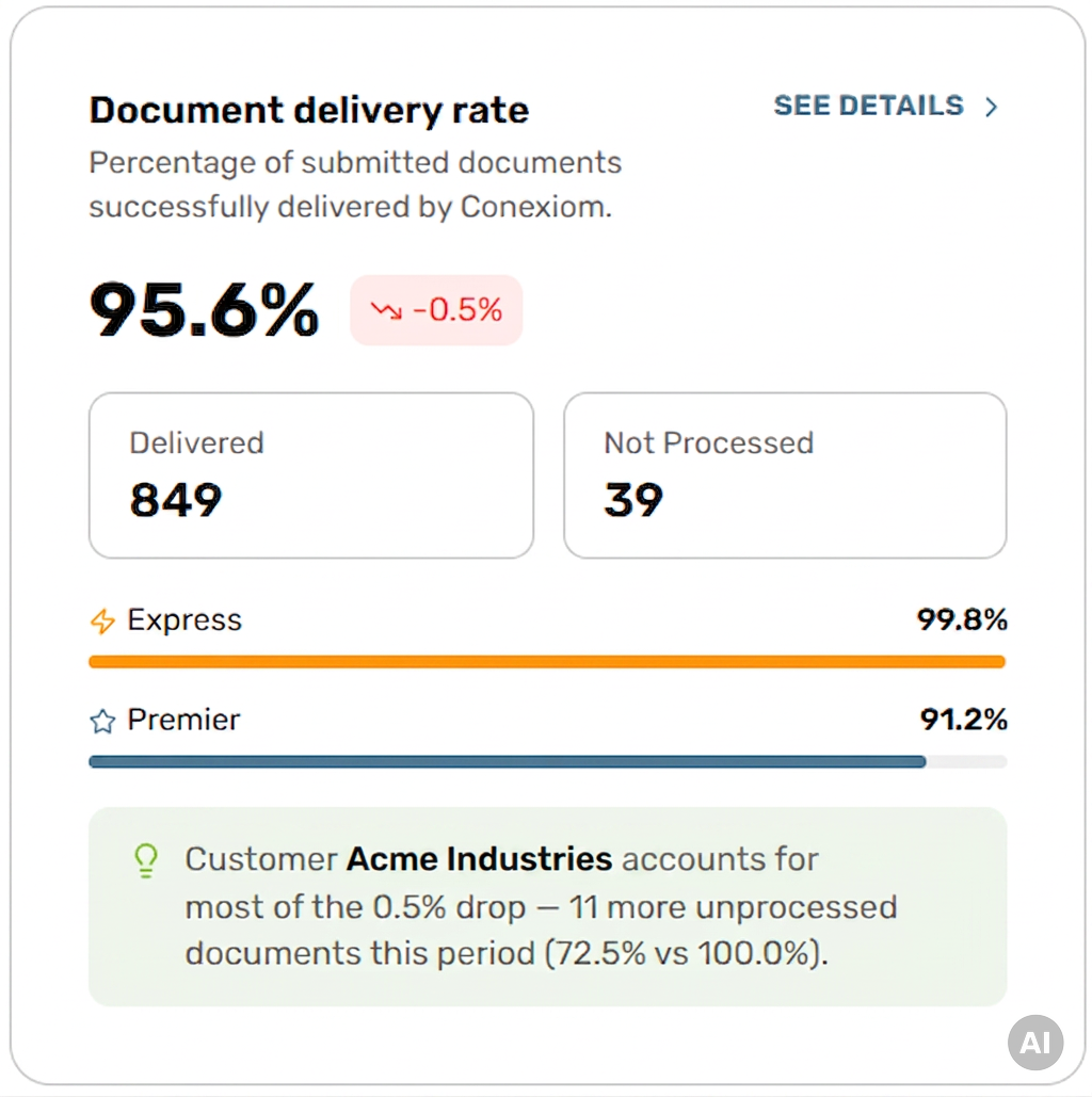
Measures the percentage of documents that were successfully delivered out of all documents that was submitted to Conexiom during the selected period. A higher rate means more orders are successfully delivered to the ERP. Clicking “See Details” opens a filtered slide-out with the ability to drill down to see details.
How It Is Calculated
Document Delivery Rate =
Delivered ÷ (Delivered + Not Processed)
The result is expressed as a percentage. Both the Delivered count and the Not Processed count are displayed alongside the rate, so the absolute volumes driving the percentage, can be seen.
What Is Included
-
Delivered documents : orders successfully processed and output by Conexiom
-
Not Processed documents : orders that entered the system but could not be delivered to ERP or failed extraction.
-
Documents processed by Express and Premier (shown as a split breakdown on the metric card).
What Is Excluded
-
Test documents
-
Duplicate submissions
-
Batch uploads
-
Map requests
-
Documents currently under review or in a delayed state
Metric Card Inference
The metric card displays a short, plain-language inference beneath the automation rate and trend indicator. The inference is generated automatically when a meaningful change in the rate is detected and explains the most likely contributing factor. The message updates dynamically based on the underlying data and active filters.
If no meaningful pattern is detected - a message “Inferences will be generated once enough data has been collected for analysis.” will display.
Available Breakdowns & Drill-Downs
-
Customer Breakdown : See Document Delivery rate per customer, including absolute counts for Delivered and Not processed documents.
-
Compare by Tier : Side by side comparison of Express vs. Premier.
-
Metric Summary : Includes an expanded insight that provides deeper context on the inference displayed on the metric card. The expanded insight identifies the specific trading partners, document types, or processing failure reasons driving the rate change. It displays the total number of documents and direct links to a sample of supporting documents that contributed to the inference and metric movement.
Filters
Respects all global filters. Trend line compares the current period against the prior equivalent period.
2. Minutes Per Line
Definition
Minutes per Line measures the average time required to process each line across all delivered documents, giving a view of processing efficiency at the line level. It also shows the average time taken to process each line in edited documents. The card also breaks this down by document tier (Premier and Express) for edited documents specifically. This metric reflects CSR effort and operational efficiency. A lower value indicates faster, more efficient document handling. Clicking “See Details” opens a filtered slide-out with the ability to drill down to see details.
How It Is Calculated
Minutes Per Line = Total processing minutes across all delivered documents ÷ total lines across all delivered documents.
-
Edited document average: Total processing minutes across edited delivered documents ÷ total lines across edited delivered documents.
-
Avg min/line on edited documents by tier: Total processing minutes for edited documents within a given tier (Premier or Express) ÷ total lines for edited documents within that same tier. Calculated separately for each tier.
-
Total lines: Sum of all lines across all delivered documents.
What is included
-
All delivered documents within the selected date range
-
Both edited and non-edited documents (for the overall average)
-
Edited documents only, segmented by Premier and Express tier (for the tier breakdown)
What is excluded
-
Documents not yet delivered.
-
Lines on documents that were Not Processed.
-
Documents that generated Unknown Customer, Buyer not setup, Ship to/Bill to/Remit To and Image validator alerts
Metric Card Inference
The metric card displays a contextual inference when a meaningful shift in average minutes per line is detected. The inference explains the likely driver of the change — for example, an increase caused by a specific trading partner generating more complex documents.
If no meaningful pattern is detected - a message “Inferences will be generated once enough data has been collected for analysis.” will display.
Available Breakdowns & Drill-Downs
-
Customer Breakdown — identify which partners drive the most CSR time
-
Compare by Tier — compare across Express vs. Premier.
-
CSR Breakdown - Identify which CSR’s are spending the most time addressing documents that require manual review.
-
Metric Summary : Includes an expanded insight that provides deeper context on the inference displayed on the metric card. It also displays sample documents with the greatest impact on metric changes during the monitored period.
Filters
Respects all global filters. Trend line compares the current period against the prior equivalent period.
3. Post Delivery Monitoring
Definition
Tracks the percentage of delivered documents that were subsequently modified in the ERP system after Conexiom delivered them. Post-delivery monitoring only tracks documents that have a closed order status in the ERP at the time of a daily data fetch. A higher rate may indicate upstream data quality issues for example, incorrect field mappings or customer data that does not match ERP records.
How It Is Calculated
Post Delivery Modification Rate = Total Modified Documents in ERP ÷ Total Documents Monitored (within date range)
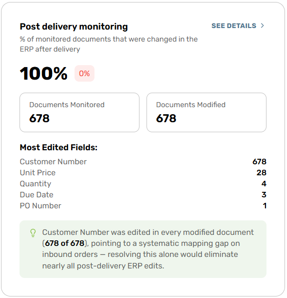
The metric card displays two counters: the number of documents Modified in ERP and the number of Documents monitored. A trend indicator shows the delta compared to the prior period. Clicking “See Details” opens a filtered slide-out with the ability to drill down to see details.
What is included
-
All documents monitored by Conexiom within the selected date range
-
Any monitored document subsequently edited in the ERP system
-
Field-level modification data — the specific fields changed, original values, and updated values
What is excluded
-
Not Processed documents (never delivered, so ERP modification does not apply)
-
ERP changes made outside the selected date range
Metric Card Inference
The metric card displays a contextual inference when the system detects a meaningful pattern in ERP modifications. The inference identifies the most frequently modified fields and the number of trading partners affected, helping teams quickly identify upstream correction opportunities.
Example inference: "Customer ABC Inc. had 230 post-delivery modifications on field `Customer Number` across 230 documents — the largest drift this period.”
If no meaningful pattern is detected, a message “Inferences will be generated once enough data has been collected for analysis.” will display.
Available Breakdowns & Drill-Downs
-
Order Accuracy By customer : Total number of modifications and monitored documents for the selected time period by trading partner and percentage of each partner's monitored documents, modified
-
Field Modifications : Top 10 fields that are most frequently changed, with original and modified values and count of customers impacted
-
Metric Summary: The expanded metric summary tab provides a summary of modification patterns, identifying which fields are driving the most ERP changes and which trading partners are most impacted. It displays the number of trading partners affected, the overall modification rate, the primary fields being corrected, and flags the trading partners with the highest individual modification rates.
-
Supporting documents are accessible directly from the Metric Summary tab.
Filters
Respects all global filters. Trend comparison is available against the prior time window.
4. Document Processing Outcomes
Definition
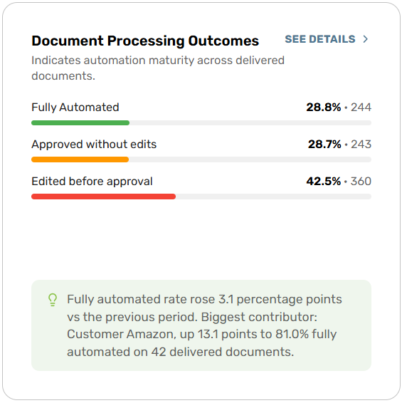
Shows the distribution of delivered documents across three outcome categories, providing a clear picture of automation maturity. Understanding the mix of Fully Automated, Approved without Edits, and Edited before approval documents indicates how much human intervention is still required. Clicking “See Details” opens a filtered slide-out with the ability to drill down to see details.
Outcome categories:
-
Fully Automated : documents successfully delivered without any manual corrections
-
Approved without Edits : documents that were flagged for manual review but required no edits upon review.
-
Edited before approval : documents where at least one edit was made before delivery.
How It Is Calculated
Each Category Percentage = Category Count ÷ Total Delivered Documents
Each category displays both a percentage of total delivered and an absolute document count.
What is included
-
All delivered documents within the selected date range and filter scope
-
All three outcome categories across Express and Premier documents
What is excluded
-
Not Processed documents : These did not reach delivery and are excluded from all three outcome categories
-
Test documents, duplicates, batch uploads, map requests and documents currently under review.
-
Documents outside the selected date range or filter scope
Metric Card Inference
The metric card displays a short inference when a meaningful shift in outcome distribution is detected. The inference explains what is driving the change in the fully automated, Approved without edits, or Edited before approval split.
Example inference: "Fully automated rate rose 3.1 percentage points vs the previous period. Biggest contributor: Customer Amazon, up 13.1 points to 81.0% fully automated on 42 delivered documents.”
If no meaningful pattern is detected, a message “Inferences will be generated once enough data has been collected for analysis.” will display.
Available breakdowns
-
Outcomes By customer : outcome distribution per customer with Express/Premier tier labels; document totals across all 3 outcome categories.
-
Compare By Tier (Express vs. Premier) : percentage breakdown of fully automated, Approved without edits, and edited before approval per tier.
-
Metric Summary : The expanded inference tab identifies the specific changes in automation behavior or trading partner activity driving the outcome shift. It surfaces which customers or experienced the most movement between categories and provides document-level evidence supporting the inference.
Filters
Respects all global filters. Trend comparison is available against the prior time window.
5. Avg. Edits Per Edited Document
Definition
Measures the depth of manual intervention required on documents that needed edits. While Document Processing Outcomes indicates how many documents were edited, this metric reveals how much work each edited document required, distinguishing between minor tweaks and heavily reworked orders.
How It Is Calculated
Average edits Per edited Document = Total edits ÷ Number of edited Documents
Along with the average edits per edited document, the metric card also displays the total edits count for the period - the absolute count of all manual edits made by CSRs. A trend indicator shows the percentage change versus the prior time window.
What is included
-
All delivered documents that required at least one edit.
-
Every individual edit recorded on those documents
What is excluded
-
Not processed documents
Metric Card Inference
The metric card displays a contextual inference when significant shifts in correction patterns are detected. The inference identifies the likely cause of the change.
Example inference: "Customer Lockridge dropped from 4.23 to 3.42 corrections/doc on 1,841 docs — main driver of the improvement."
If no meaningful pattern is detected, a message “Inferences will be generated once enough data has been collected for analysis.” will display.
Available breakdowns
-
Edits by Customer : displays total edits and average edits per edited document split by customer.
-
Edits by CSR : total edits and average edits per edited document (scoped to alert-generated documents only) split by CSR.
-
Metric Summary : The expanded inference tab provides a breakdown of which customers are driving the change in edit depth. It identifies whether the shift is concentrated to specific customers or field types, and displays the impacted document count and document-level evidence supporting the inference.
Example Metric summary Inference: "Customer Ardagh averaged 2.72 corrections/doc on 39 corrected documents — the most corrections per corrected document this period."
Filters
Respects all global filters. CSR breakdown is scoped to documents that triggered an alert requiring manual intervention.
6. Types of Edits
Definition
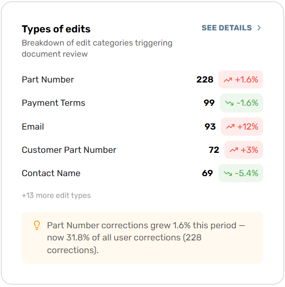
Displays the most common error categories triggering alerts in documents that required manual review, ranked by frequency. Understanding edit distribution helps teams prioritize fixes and measure the impact of automation improvements over time.
Note: This metric covers Processing Errors on documents that generated alerts and entered manual review. Not Processed document data is not included.
How It Is Calculated
Edit Count per Type is a direct count of occurrences within the selected date range and filter scope. The metric card displays the top 5 edit types. All remaining types are summarized as "+X more edit types." A trend indicator for each type shows whether that error is increasing or decreasing relative to the prior comparable period, expressed as a percentage.
What is included
-
All edits in documents that required manual review within the selected date range and filter scope
What is excluded
-
Documents outside the selected date range or filter scope
-
Not processed documents
Metric Card Inference
The metric card displays an inference when the system detects a meaningful error pattern, such as a sustained increase in a specific edit type or a concentration across multiple customers. The inference identifies the edit type and the impacted document count.
Example inference: "Customer UOM corrections fell 9.4% — dropped to 6.0% of all corrections (126 corrections)”
If no meaningful pattern is detected, a message “Inferences will be generated once enough data has been collected for analysis.” will display.
Available breakdowns
-
Edit Types Breakdown : full list of edit types with count, percentage of total errors, and trend vs. prior period
-
Metric Summary: The expanded inference explains the root cause context behind the prominent edit pattern. It surfaces what the likely operational cause is, and how many documents are contributing to the pattern. Supporting sample documents are also available.
Filters
Respects all global filters. Trend comparison is available against the prior time window.
7. AI Accuracy Score
Availability
This metric is available exclusively to customers processing documents for their trading partners via Express.
Definition
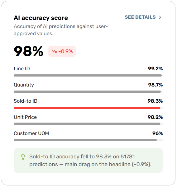
Measures how often Conexiom’s AI predictions are accepted without correction across all fields and all documents. This is the headline indicator of AI model performance. A higher score means the AI is reliably predicting correct values, reducing the need for CSR review. The metric card also surfaces the top 5 fields with the highest accuracy for an at-a-glance view of where the AI performs best.
How It Is Calculated
Overall AI Accuracy = Predicted Values Approved Without Correction ÷ Total Predicted Values
The result is expressed as a percentage. A trend indicator compares accuracy against the prior time period.
Field-Level Accuracy = Field Predictions Approved Without Correction ÷ Total Predictions for That Field
Field accuracy is calculated independently per field type.
What is included
-
All documents processed via Express.
-
All AI predictions made on Express documents within the selected date range and filter scope
-
Predictions accepted by a CSR without modification (counted as accurate)
-
Predictions corrected by a CSR (counted as inaccurate)
-
Field-level accuracy breakdown, calculated separately per field type
What is excluded
-
Not Processed documents
-
Predictions outside the selected date range or filter scope
Metric Card Inference
The metric card displays a contextual inference when a meaningful accuracy change is detected. The inference explains provides a brief explanation of the contributing factor.
Example inference: "Price Change Date accuracy climbed to 99.9% from 25.3% — biggest single contributor to the 15.5% improvement."
If no meaningful pattern is detected, a message “Inferences will be generated once enough data has been collected for analysis.” will display.
Available breakdowns
-
Overall Accuracy Trend Over Time
-
Accuracy by Field type : accuracy across all predicted field types
-
Accuracy by Customer : accuracy percentage, prediction volume, and trend per customer.
-
Metric Summary: The expanded inference tab provides field-level context on the accuracy change. It identifies which fields improved or regressed, the volume of predictions affected, and the factors contributing to the shift. Supporting documents contributing to the metric, are available as well.
Filters
Respects all global filters. Trend comparison is available against the prior time window.
8. Sold-To ID AI Confidence vs. Accuracy
Availability
This metric is available exclusively to customers processing documents for their trading partners via Express.
Definition
Shows how the AI's confidence level maps to actual accuracy outcomes for Sold-To ID predictions. Understanding which confidence ranges produce the most accurate predictions supports informed decisions about how confidence thresholds can be adjusted to increase touchless volume without compromising accuracy.
How It Is Calculated
Results are grouped into four confidence buckets: 80–85, 85–90, 90–95, 95–100. Two accuracy measures are displayed per bucket:
Top-1 Accuracy = whether the AI's first recommendation was correct
Rank 2-3 Accuracy = whether the correct value appeared anywhere within the AI's top 2nd and 3rd recommendations.
When rank 2-3 accuracy is higher. It is useful to evaluate whether lowering confidence threshold is safe.
What is included
-
All Sold-To ID predictions within the selected date range and filter scope
-
Predictions grouped into confidence buckets: 80–85, 85–90, 90–95, 95–100
-
Both Top-1 and Top-3 accuracy measures per bucket
-
Trading partner accuracy distribution across confidence buckets
What is excluded
-
Non-Sold-To ID field predictions (covered in the AI Accuracy Score metric)
-
Documents not processed through Express.
-
Predictions outside the selected date range or filter scope
Metric Card Inference
The metric card displays a threshold guidance inference that highlights which confidence bucket delivers the highest volume, and which delivers the highest accuracy. The inference updates dynamically based on the underlying data and active filters.
Example inference: "0.7% of predictions in the below-80 bucket have the correct customer at rank 2 or 3 (Top-1 is 94.2%) — a reviewer can select the correct value from the AI's suggestions to correct the prediction."
If no meaningful pattern is detected, a message “Inferences will be generated once enough data has been collected for analysis.” will display.
Available breakdowns
-
Top-1 Accuracy Trend by Confidence Bucket — accuracy over time per Confidence bucket
-
Rank 2-3 Accuracy Trend by Confidence Bucket — Displays Rank 2-3 accuracy trend.
-
By Customer — Top-1 accuracy, Rank 2-3 accuracy, and confident bucket distribution per customer ; customers sorted by accuracy.
-
Metric Summary : The expanded inference tab shows the lowest confidence sold to id predictions. Supporting documents contributing to the metric, are available as well.
Example Metric Summary : Lowest-confidence sold-to ID predictions this period : AI confidence is well-aligned with accuracy this period — no range is materially over-confident. These are the lowest-confidence sold-to ID predictions (below-80% confidence, accurate 82.6% of the time), shown for review.
Filters
Respects all global filters. Trend comparison is available against the prior time window.
9. Mandatory Fields AI Confidence vs. Accuracy
Availability
This metric is available exclusively to customers processing documents via Express.
Definition
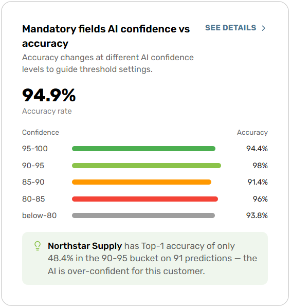
Shows how the AI's confidence level maps to actual accuracy outcomes for mandatory field predictions. Understanding which confidence ranges produce the most accurate predictions for required fields supports informed decisions about how confidence thresholds can be adjusted to increase touchless volume without compromising the accuracy of fields that are critical to order processing.
How It Is Calculated
Accuracy Results are grouped into four confidence buckets: 80–85, 85–90, 90–95, 95–100. A prediction is considered accurate if it was approved without correction and is calculated as Total no. of AI predications approved without correction ÷ Total Predictions for That Field
What is included
-
All AI predictions made on mandatory/required fields within the selected date range and filter scope
-
Predictions grouped by confidence bucket: Below 80, 80–85, 85–90, 90–95, 95–100
-
Accuracy measures per bucket and per mandatory field type
-
Trading partner breakdown with accuracy distribution across confidence buckets
What is excluded
-
Non-mandatory (optional) field predictions — these are covered by the AI Accuracy Score metric
-
Predictions with a confidence score below 80
-
Not Processed documents
-
Predictions outside the selected date range or filter scope
Metric Card Inference
The metric card displays a short inference summarizing automation readiness and threshold safety for mandatory fields. The message identifies which confidence bucket offers the best balance of accuracy and touchless volume for required fields, and updates dynamically based on the underlying metric values and active filters.
Example inference: "Customer ABC INC. has Top-1 accuracy of only 52.8% in the 90-95 bucket on 36 predictions — the AI is over-confident for this partner."
If no meaningful pattern is detected, a message “Inferences will be generated once enough data has been collected for analysis.” will display.
Available breakdowns
-
Accuracy Trend — accuracy over time per Confidence interval.
-
By Customer - See the accuracy rate by Customer.
-
Metric Summary : The expanded inference tab provides field-level context on the accuracy change. Supporting documents contributing to the metric, are available as well.
Example Metric Summary : “Lowest-confidence mandatory fields predictions this period : AI confidence is well-aligned with accuracy this period — no range is materially over-confident. These are the lowest-confidence mandatory fields predictions (below-80% confidence, accurate 93.8% of the time), shown for review.”
Filters
Respects all global filters. Trend comparison is available against the prior time window.